We’ve all seen them: the breathtaking gallery walls in design magazines that look effortlessly collected over a lifetime. And we’ve all seen the other kind: the sad grid of mismatched frames from a big-box store, hung with desperate hope, that somehow makes a wall look more anxious, not more artistic. The difference between a gallery wall that sings and one that screams isn’t money or innate talent. It’s intention.
A gallery wall is not just a way to fill empty wall space. It’s the ultimate expression of visual storytelling. It’s a curated exhibition of your life, your tastes, your memories, and your eye. Done poorly, it’s visual noise. Done well, it becomes the soulful focal point of a room, a conversation starter, and a daily source of inspiration. Let’s move from haphazard hanging to thoughtful curation.
Part 1: The Mindset Shift: Curation, Not Decoration
Before you hammer a single nail, internalize this: You are not decorating a wall. You are curating a collection. This changes everything.
- A decorator buys filler. A curator seeks meaning.
- A decorator worries about matching. A curator seeks harmony.
- A decorator finishes a project. A curator starts a collection that will grow.
Your gallery wall should have a point of view, even if that point of view is simply “Things We Love.”
Part 2: The Three Pillars of a Compelling Gallery Wall
Pillar 1: Cohesion (The “Glue”)
This is what makes a group of disparate items feel like a single statement. Cohesion can be achieved through:
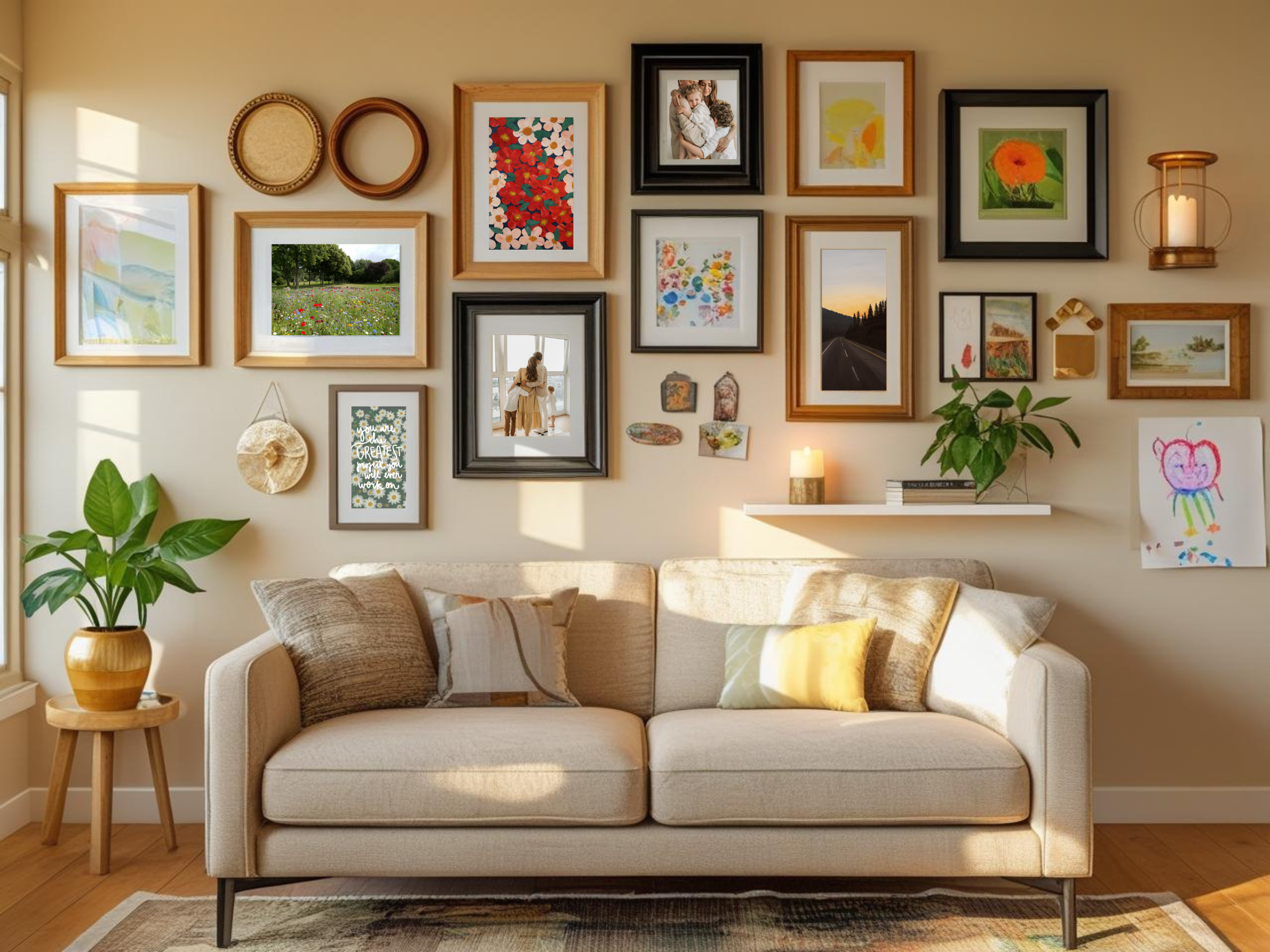
- Color Story: Limit your palette to 2-3 main colors that repeat throughout the pieces. A black-and-white photo wall is cohesive. A wall with pops of burnt orange and sage green throughout is cohesive.
- Frame Style: You don’t need all the same frame, but they should converse. Maybe all wood tones (walnut, oak, black-stained). Maybe all thin, metal frames. Maybe a mix, but with a consistent mat color (always white, always cream).
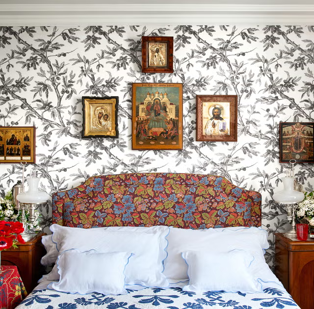
- Subject Matter: All travel photography. All botanical prints. All abstract line drawings. All family portraits in a consistent style. A unifying theme provides instant cohesion.
Pillar 2: Composition (The “Choreography”)
This is the layout—how the pieces relate to each other in space.
- The Anchor: Start with the largest, strongest, or most important piece. This is your anchor, usually placed just off-center.
- Balance, Not Symmetry: You’re not building a spreadsheet. Balance visual weight. A large piece on the left can be balanced by a cluster of three smaller pieces on the right. Step back and squint. Does one side feel heavier?
- The Magic Spacing: Keep the spacing between frames consistent. 1.5 to 3 inches is usually perfect. This uniform “breathing room” is what makes a complex arrangement feel orderly.
- Eye-Level Rule: The center of the entire arrangement should be roughly at eye level (57-60 inches from the floor). This is museum standard for a reason—it’s comfortable to view.
Pillar 3: Contrast & Variety (The “Interest”)
Cohesion without variety is boring. You need spice.
- Mix Scales: Combine large, medium, and small pieces.
- Mix Orientations: Blend vertical (portrait) and horizontal (landscape) formats.
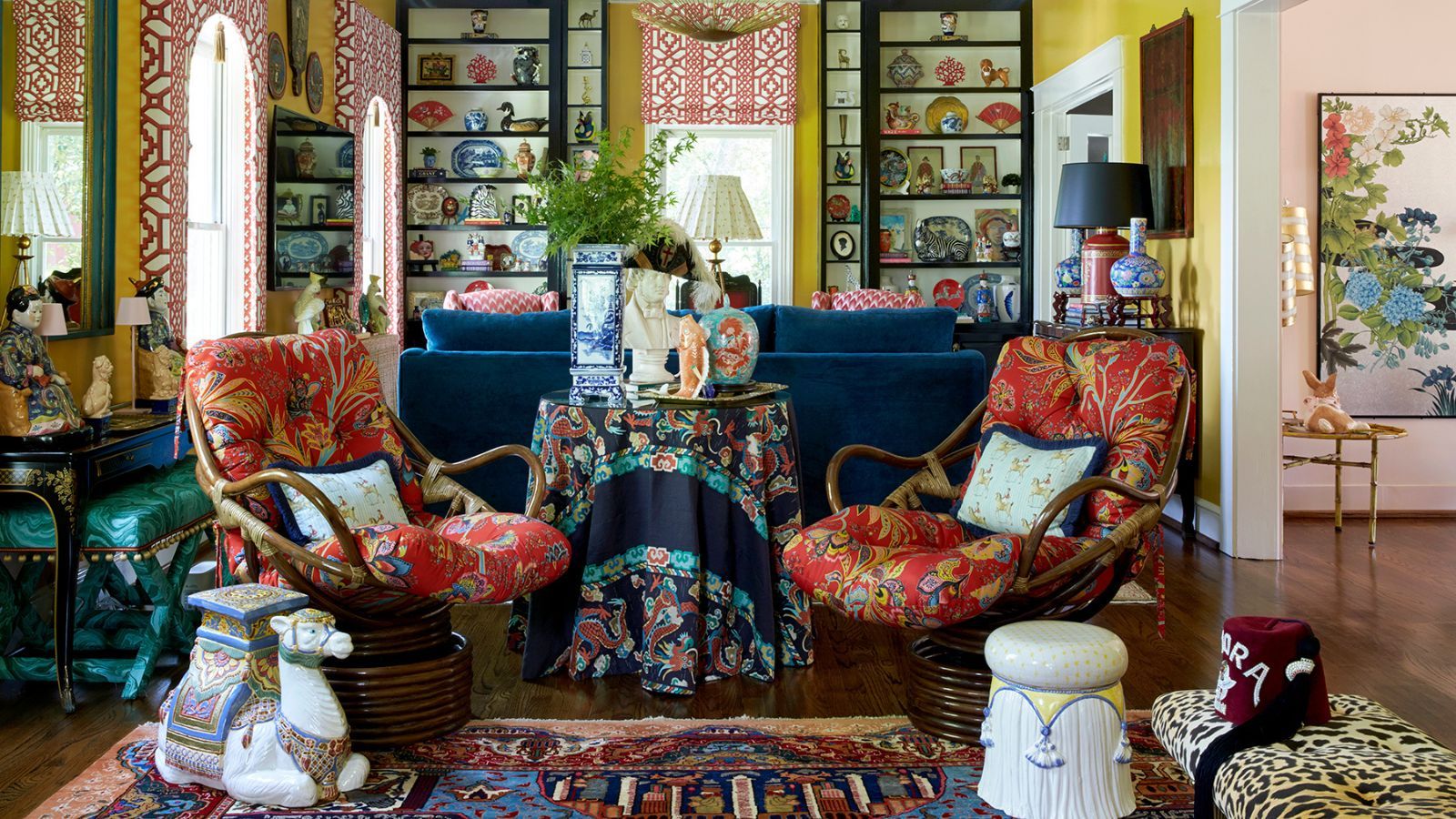
- Mix Media: Don’t just use framed prints. Incorporate a small mirror, a piece of textile or woven basket, a floating shelf with a small object, a 3D letter, or a collection plate. This adds texture and depth.
- The “Odd One Out”: Include one piece that breaks your own rules just a little—a splash of unexpected color, a differently shaped frame. This gives the collection personality.
Part 3: The Foolproof Method: How to Hang Without Regret
The #1 gallery wall killer is guesswork and hammering holes willy-nilly.
The Paper Template Method (Non-Negotiable):
- Lay it Out on the Floor: Arrange all your art on the floor in front of the wall. Play with composition until you love it. Take a photo for reference.
- Make Templates: Trace each frame onto craft paper or newspaper. Cut out the templates and label them (e.g., “Large botanical,” “Grandma’s portrait”).
- Tape Templates to the Wall: Using painter’s tape, arrange the paper templates on the wall, using your photo as a guide. This is your chance to walk away, live with it for a day, and adjust before any holes are made.
- Mark the Hangers: On each paper template, make a small mark where the hanging hardware (nail, hook) needs to go. A simple trick: put the hook on the frame, hold the paper template against it, and mark where the hook’s point touches the paper.
- Hammer Through the Paper: Hammer your nail or hook right through the mark on the paper template.
- Rip Away and Hang: Tear away the paper and hang your art perfectly. Revel in your genius.
Part 4: The Curator’s Playbook: Sourcing with Soul
A great gallery wall is collected, not purchased in one trip.
- The Personal (Heart): Your own photography, children’s art, wedding vows in a frame, vintage family photos, a map from a favorite trip, a pressed flower from your garden.
- The Found (Soul): Thrift store paintings, old book plates, postcards, record covers, unique plates, antique keys under glass. Things with patina and mystery.
- The Commissioned (Support): Art from local artists, Etsy printmakers, or a friend. This supports creativity and gets you something unique.
- The “Permanent Loan” (Bones): A few great, affordable prints from museums (The Met, MOMA) or art sites (Society6, Juniper Print Shop) to fill gaps and elevate the whole collection.
Conclusion: Your Wall, Your Story
A gallery wall is a living entity. It should evolve. Leave a little space for the future find, the next vacation photo, the piece of art you haven’t discovered yet.
When you stand back and look at your finished wall, it shouldn’t just say, “I filled this wall.” It should whisper stories. It should reflect a journey. It should make you smile because that small sketch is from your best friend, that photo captures a perfect moment, and that weird thrift store painting just makes you happy for reasons you can’t explain.
Forget perfection. Seek connection. Start with one piece you love. Then another. Build slowly. Curate with heart. And remember: the most beautiful gallery walls aren’t found in museums. They’re the ones that tell the story of a life, hung with love on the walls of a home.
FAQs: Your Gallery Wall Questions
Q1: What if I’m renting and can’t put a million holes in the wall?
A: The rental-friendly revolution is here!
- Command Strips & Hooks: They make versions now that can hold several pounds and are safe for most walls. Test one first in an inconspicuous spot.
- The “Shelf Solution”: Install one or two long, floating shelves (often easier to patch than many small holes). Lean your art against the wall on the shelves. This is dynamic, flexible, and looks incredibly chic.
- The “Floor Gallery”: Don’t hang at all. Line up larger pieces along the floor, leaning against the wall (safely and securely). This is a very relaxed, editorial look.
Q2: How do I mix frames without it looking like a thrift store exploded?
A: Create a “Family” of Frames. Choose one unifying characteristic. For example:
- All Black Frames: But mix thin, thick, ornate, and simple.
- All Wood Tones: Mix light oak, dark walnut, and natural bamboo.
- All Gold/Metal: Mix brushed brass, polished gold, and black metal.
- All White Mats: This is the ultimate unifier. Any frame style looks curated if it has a crisp white mat inside.
Q3: What’s the right number of pieces to start with?
A: Start with an odd number (3, 5, 7) for a more dynamic look. A 3-piece cluster is a perfect, low-commitment start. You can always grow outwards. It’s better to start small and strong than to force-fill a large wall with weak pieces.
Q4: How high should I hang everything?
A: The 57-inch rule is your guide: The center of your entire arrangement (or of a single piece) should be 57 inches from the floor. This is standard gallery height. In a room where you’re primarily seated (a dining room), you might lower it slightly so it’s best viewed from a chair. Always adjust for your own eye level and ceiling height.
Q5: What’s the biggest mistake you see?
A: Pieces hung too high and too far apart. Art floating near the ceiling with a vast field of wall below it feels disconnected and anxious. Art placed with giant, uneven gaps between pieces looks scared and uncertain. Bring your art down to living level and cluster it with consistent, intimate spacing. This creates impact and connection.